BCA Live Auction Redesign
Role
When
Senior Product Designer
Jan - Dec 2022
Apps & skills
Figma (lo-fi/hi-fi designs, prototypes, interaction design & final UI), Miro
Summary
During the Covid19 pandemic, BCA, the UK’s largest vehicle auction company rapidly transitioned to operate 100% of their sales purely online. Live Online, their desktop-only, web auction platform was now considered legacy technology and was becoming increasingly difficult to maintain and improve.
It was one of the last remaining pieces of their B2B experience that needed to be transitioned across to their new web platform and rebuilt in React. Being their flagship product it also made sense for it to be the first journey to make full use of the brand new BCA Design System.
Design Process

We relied upon qualitative data as they didn't have a great deal of tracking in place on the legacy system (something we’ve definitely improved!). Fortunately a large body of customer research had recently been undertaken that delved into the entire end-to-end auction journey and part of the outputs was a detailed customer friction map.
We plotted the existing journey and analysed the friction map, identifying user pain points and together with stakeholders agreed upon the key areas of improvement.


Key Design Objectives

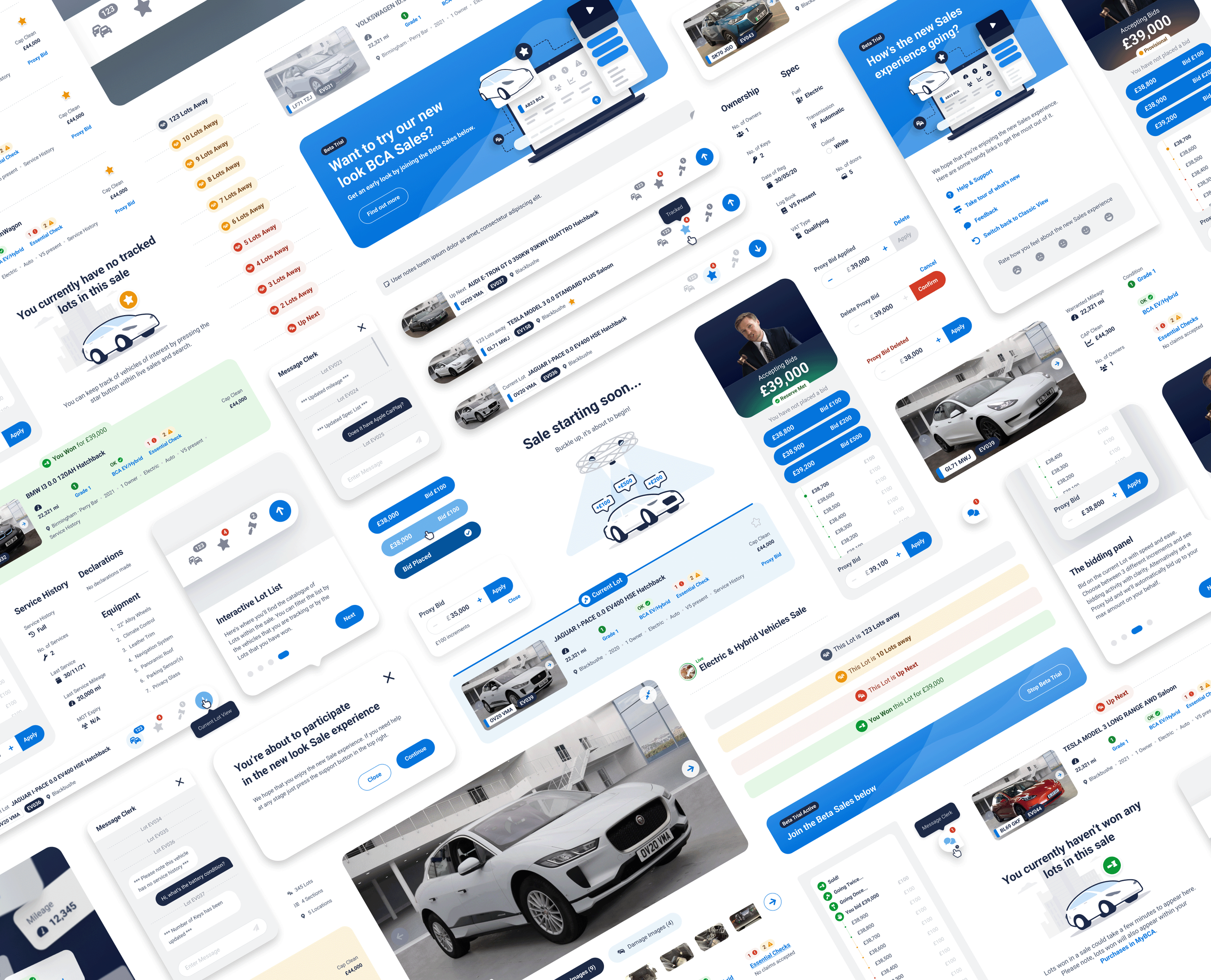
Shortlisting
Users can “track” vehicles of interest whilst researching potential purchases but this shortlist cannot be accessed within the sales environment which has lead to users having to manually identify the vehicles that they’d like to bid on again by noting the lot number or registration plate.

Notifications
One of the largest frustrations users had was it wasn’t always obvious whether they’d won a Lot. This was largely a hangup from pre-Covid times where bids could either be in-person or online so a manual process would take place after the Lot had sold to determine the winner.

Clarity of data
Users were often overwhelmed by the existing cluttered and data-heavy layout but at the same time they also relied upon being able to see important vehicle detail (mileage, damage etc) for reassurance before making any last minute bidding decisions.

Improve UX/UI
The cluttered and dated experience was in great need of improving and now more than ever felt like a completely separate site. This was not only the opportunity for a long needed visual refresh but also for it to finally be integrated within the wider BCA auction journey.

Design System
In the background I was also working on the new BCA Design System and the new Auction experience, being BCA’s flagship product was the first part of their website outside of marketing content that would adopt our brand new DS foundations and component library.

Foundations
This would be a new beginning for BCA’s digital auctions, unshackled from the limitations of before, these will be firm foundations built upon a greater understanding of our users and with stronger tracking and analytics in place for better informed future enhancements.

Ideation
Myself and another designer began by sketching some early ideas around how to tackle the agreed design objectives, checking back in on a regular basis to walk through and sanity-check progress. These gradually evolved into some early lo-fi wireframes that we presented back to UX, Product, Engineers and other key stakeholders during regular playback sessions.
Over the weeks we progressed with wire framing, incorporated feedback and combined the best ideas from both our designs. Throughout this process we were strengthening and gaining confidence and clarity in what the initial solution could look like. It was time to validate these ideas by testing them with customers.
Prototyping & Testing
We worked closely with our UX Research team to devise a test plan - we wanted to run a series of moderated prototype tests with a variety of different customers (from smaller trade buyers to our largest group buyers) to validate our designs and to ensure that we were on track to meet our design objectives.
The first test focussed on the clarity of vehicle detail. Although users often do their homework in advance of live auctions, getting to important last minute vehicle information can be critical when deciding whether to or how much to bid.
We had a couple of different layout approaches to test. The first was a vertical detail layout, which presented the full vehicle detail in a series of lists, the most important information from each category being closer to the top. This was to insure as much vital information would be in view and so users were less likely to need to scroll far on smaller screens.
The second was the horizontal detail layout which was more consistent with how vehicle information was presented on the Vehicle Detail Page that users see when browsing vehicles. The details are presented in the same order as the vertical option but increases the need for scrolling to see all information.

Vehicle detail layout
Initial tests were very positive - the vertical detail layout was generally preferred, especially if they were pressed for time. Users also were asked about the order of the details which led to a slight reshuffle in the order of a couple of data points. After incorporating this feedback we were very confident in how vehicle detail is presented. The next part to test was possibly the most important - the bidding panel.
To simulate a live auction I had to create a series of detailed prototype sequences that the users could interact with during the tests. Although these sequences were linear and perhaps lacked the unpredictable nature of real live auctions, they were detailed enough to convey to users how the bidding panel and it’s constituent components work together to communicate the progress of the auction.
Bidding panel breakdown

We tested a variety of options for the bid buttons - we had 3x increment buttons with a variety of options for what labels they contained, we also had a more simple 1x lowest increment button and also a more advanced component that allowed the user to set the increment and then bid. The winning option is perhaps the most basic - show all three increments and display both the amount that the user is bidding and the increment value within. Users felt more comfortable with this approach as there was zero ambiguity.
The users were very happy with the clarity of how bids were displayed within the feed, mentioning it was a significant improvement over the existing. They also loved how every part of the bidding panel worked together seamlessly and that it felt very intuitive and responsive - something that would be vital to replicate when built.

The next area we wanted to test was the overall navigation of the list of vehicles that are being auctioned. To access this list the user needs to interact with the floating bar displayed at the bottom of the screen. Within this bar you see a snapshot of the Lot that is up next and also menu buttons to see All Lots within the sale, just those they are tracking and lastly any Lots that they have won.
From within the Lot List users can see the high level vehicle summaries and if they want to see further detail they can delve into it without having to navigate away from the live sale.

Sale navigation
Users loved that they could see the vehicle summaries and access image galleries and notes within the list (all improvements over the current platform) they also loved that they could finally filter and see just their tracked vehicles and they found the badge displaying the count of how many Lots away very useful as this is something they have to manually count currently.
Our worries over whether users would be comfortable interacting with the catalogue of Lots (as interaction-wise it is quite a step change from the existing) soon subsided. By and large the majority of users were quick to identify the bar and started exploring very quickly. We did however think it would be great to showcase the use of it during an onboarding process which could also delve into the extra details around seeing your tracked Lots and being able to set proxy bids for vehicles in advance of them being auctioned a lot easier.
Finalising UI
& DS components


At the time BCA was also going through a creative rebrand, adopting a more friendly aesthetic, more suitable for digital experiences. Whilst working on the Live Sale redesign I was also busy co-creating the foundations and early components for the new BCA Design System. The new DS didn’t just need to perfectly embody this new creative direction it had to spearhead it.
Working on both at the same time allowed me to quickly validate early DS design decisions and feed improvements back into the wider DS. Each iteration of design felt like substantial strides from the previous look & feel towards the new.
We continued the process of regular playbacks with stakeholders and as we refined the design further we also started to include members of the DS team to discuss the approach for components. Through these meetings we clarified what needed to be built and provided by the DS team through our DS component library and what could be built (using our DS foundations) within the Live Sales squad.

The end result wasn’t just a visual refresh but a highly considered and validated experience that perfectly complimented the new BCA creative direction, brought to life through DS foundations and components and the cross-collaboration of multiple teams.
This was a particularly rewarding body of work for me, I was at the centre and a driving force throughout and although at times it felt like a lot to juggle, it (and the BCA Design System) benefitted hugely from my overarching, tireless work.